formerly VMM Illustrations
Medora Hotel
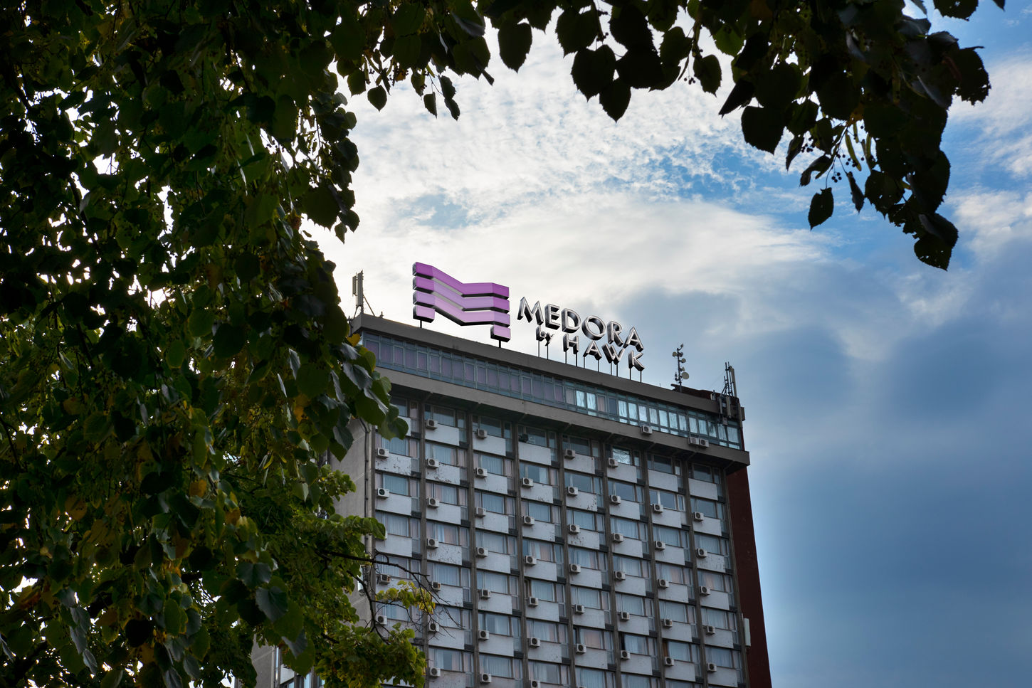
Medora by Hawk needed a brand that could match the ambition of its hospitality offering - a visual identity that felt elevated, contemporary, and instantly recognisable, no matter where a guest encountered it. Rather than starting with aesthetics alone, we treated the identity as an experience in itself: something guests see from afar on a skyline, engage with at check-in, and interact with subtly through every touchpoint of their stay.

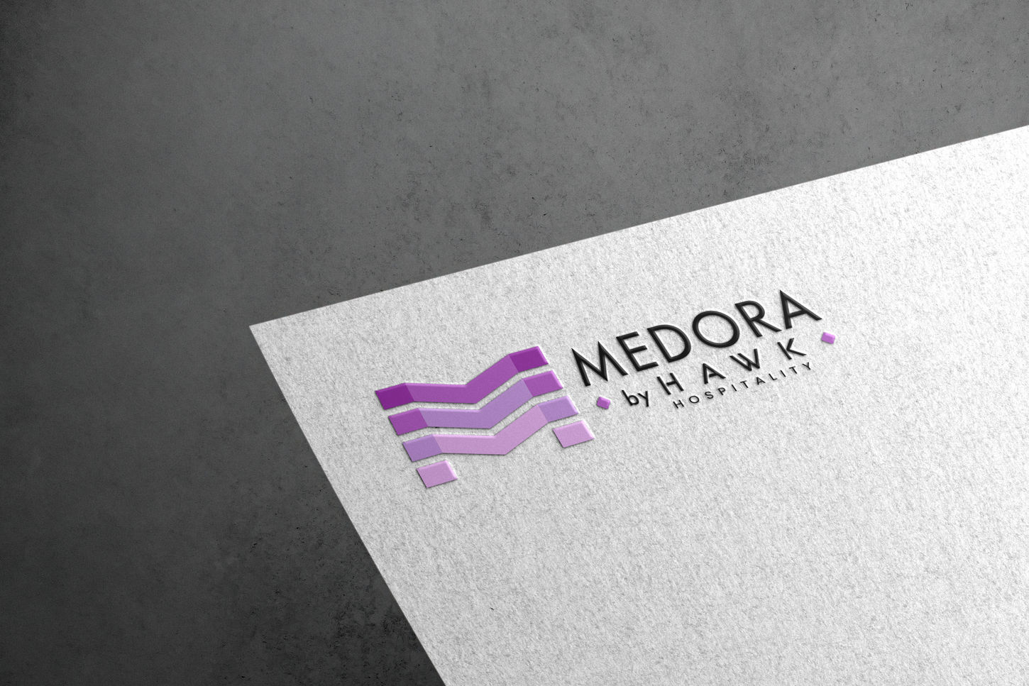
At the centre of the system is a bold architectural symbol, built to convey layers, structure, and upward movement. This form creates a sense of presence without overwhelming, and when paired with a refined wordmark, it becomes a signature that feels both modern and timeless. From there, the identity unfolded into the hotel environment - large-scale signage, elegant reception branding, and polished stationery - each designed to reinforce a sense of intention and sophistication.
We carried this consistency into operational details as well. Staff uniforms, embroidery accents, and colour-matched applications ensure the brand feels cohesive whether a guest is speaking with the executive chef or walking through the lobby. Across every medium, Medora’s identity adapts gracefully, maintaining clarity, character, and a distinctly premium impression. The final result is a brand that doesn’t just represent a hotel - it frames the entire hospitality experience.


