formerly VMM Illustrations
Ceto Fresh
When we set out to craft Ceto Fresh’s brand identity, we wanted to capture the essence of what makes it unique - a brand built on freshness, affordability, and convenience. Ceto Fresh isn’t just another online grocery service; it’s a promise of quality, ensuring that families and businesses receive the freshest fish, chicken, and vegetables right at their doorstep. Whether it's a home-cooked meal or a restaurant order, Ceto Fresh stands as the trusted link between nature’s bounty and the modern-day kitchen.

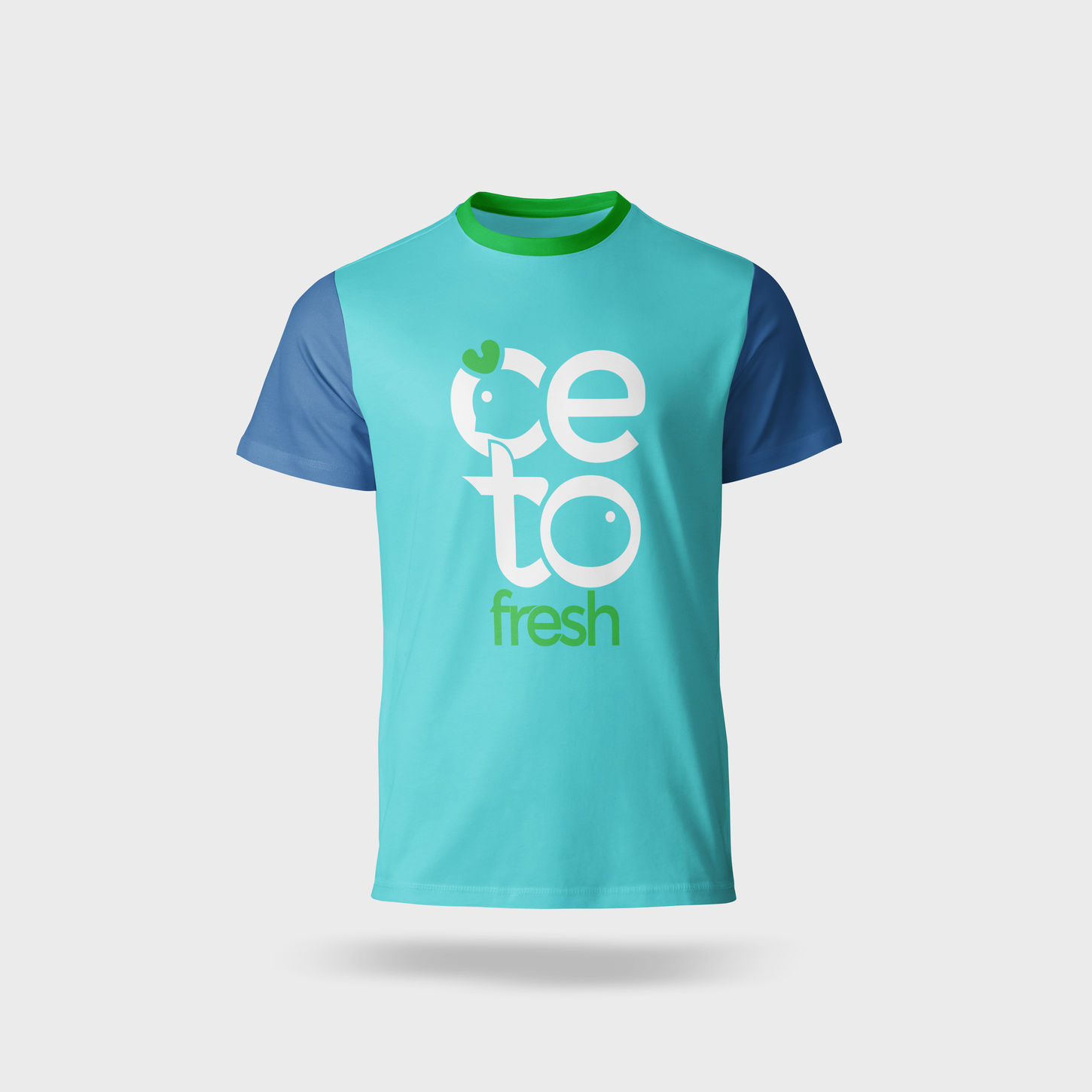
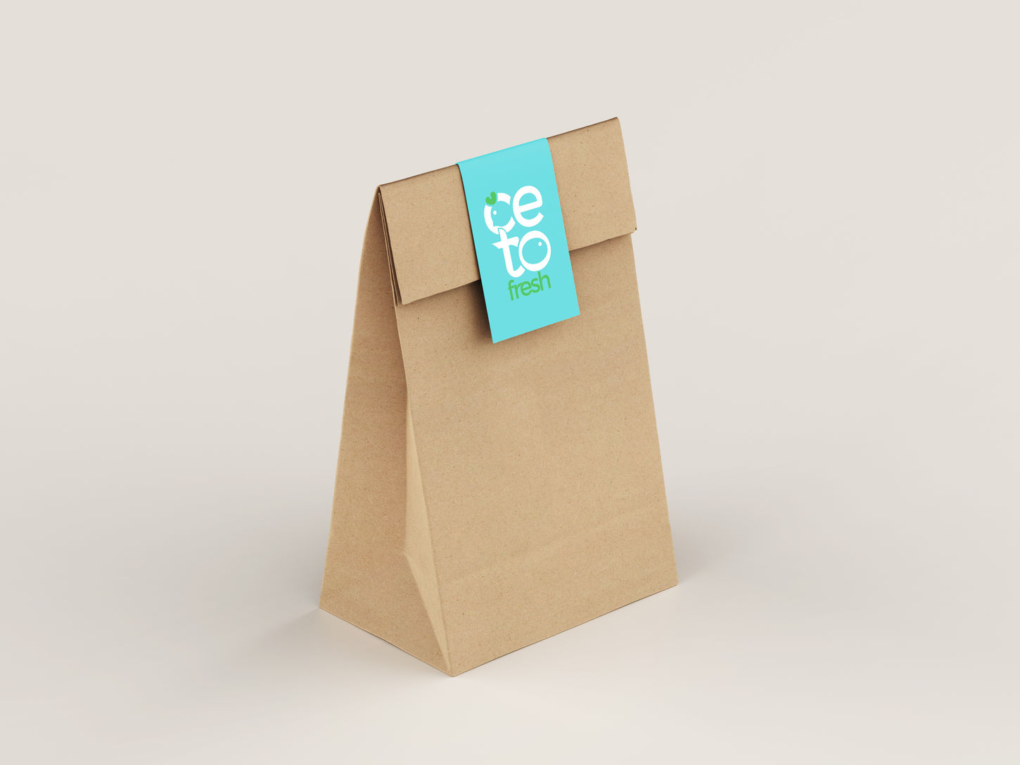
Our approach to Ceto Fresh’s identity was to blend high-end technology with a warm, customer-friendly experience. The logo is designed with subtle yet meaningful elements - negative space forming a fish and a chicken, representing the brand’s core offerings. The rounded, modern typography reflects an approachable, seamless, and tech-driven service, ensuring a smooth shopping experience for customers. The color palette of fresh greens, calming turquoise, and vibrant yellows not only mirrors nature and trust but also adds a touch of energy and optimism - because grocery shopping should feel as fresh and delightful as the produce itself.
More than just a marketplace, Ceto Fresh is a movement towards better quality and hassle-free shopping. It caters to households, restaurants, and communities, ensuring that freshness is never compromised. With real-time pricing and availability through its app, customers are always in control of their choices. The brand values - quality, freshness, and happy customers - are at the heart of everything Ceto Fresh does. This isn’t just a business; it’s a lifestyle shift, making premium grocery shopping effortless and accessible.


